Dulux’s annual Colour Forecast for 2025 predicts a shift towards uplifting and soothing colours both in residential and commercial spaces, as design trends reflect a response to recent periods of uncertainty.
Evoking a sense of nurture and positivity, colours with warm, brown undertones are coming to prominence, with Dulux predicting an increased use of rich burgundies, wine hues, and olive and sage tones next year.
Dulux Colour and Communications Manager Andrea Lucena-Orr said that the current economic pressures facing consumers are affecting the colours they are seeking out in interior design.
“During times of instability, such as the current cost-of-living crisis and ongoing overseas conflicts, reduced consumer sentiment tends to see colour trends shift less dramatically. However, colour can be a powerful antedote to lift spirits and provide a sense of comfort and warmth, which is evident with this year’s colour palettes,” she said.
Additionally, the continued pressures of digital connection and the rise of AI are pushing consumers towards earthy and natural tones.
“There is a sense to slow down and appreciate life’s everyday moments, to look for joy in our surroundings and find comfort in reminiscing about times when we felt safe and secure. These shifts have informed the three Colour Forecast palette trends for 2025 in a way that’s relevant for Australian interiors.
“One of the most significant shifts this year is the increase in warm neutrals across the three palettes. During uncertain times we often see a move towards muted colours and calming pastels that help make us feel grounded and provide a sense of relief from everyday stresses,” Andrea added.
However, bright colours are still popular, especially as accent colours, as they serve to lift people’s moods during difficult times.
“As a counterbalance, brighter and joyful colour is emerging as a trend, used to create expressive interiors that bring a smile to your face. Pink continues to be present, however it has a brown undertone, making it a perfect neutral base within a colour scheme and we are seeing a greater influence of lilac and purple. Cobalt blue continues to feature as an accent shade, but blue with a purple undertone is a newer direction this year,” Andrea said.
Hospitality hues
Not just confined to the sphere of home improvement, Andrea said that a small change in colour can have a big impact on a hospitality venue.
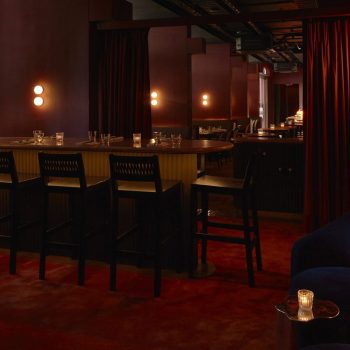
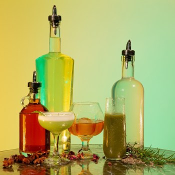
“Hospitality venues can use colour to lift their interior and excite their space to entice new customers. Simply adding some new colour can transform a space and create an entirely different mood. Whether you’re looking for some extra light reflectance to make it feel brighter and more lively, or a deeper darker colour to add a moodier feel, colour can help connection and brings out emotion,” she said.
Additionally, a colour refresh can make a venue a more exciting place to work.
“Not only can colour transform a hospitality space for customers to reap its benefits, it can also help lift morale with the staff who work in that space,” Andrea added.
With hospitality businesses feeling the same economic pinch as consumers, engaging with colour trends can be achieved on a budget.
“The beauty of adding paint and colour to a hospitality space is it can be done on a small budget. You can also start in small projects and maybe do a smaller space first. The other positive today is we have paint that has little to no odour which means you could paint on your day off and it’s ready the very next day.
“Changing colour can definitely give your interior space a big lift and re-energise the look and feel of the area. Moving towards a more up-to-date colour can also help bring a sense of modernism and help promote your hospitality venue as the latest place to eat and drink,” Andrea said.
2025 Palettes
Dulux has created three colour palettes to help enthusiastic amateur designers to understand how the on-trend shades for 2025 can work together, and how textures and furnishings can complete the look.
Dulux Still creates a calming effect with colours that mimic nature, with warm grey as an accent against yellow based neutrals and greens, and paired with serene cool blues. This palette also integrates natural surfaces and simple patterns, with Colour Forecaster Stylist Bree Leech prioritising eco-friendly materials.
“Stone ceramics, wood, organic cotton, linen and hemp are seen alongside patterns that feature primitive line work style patterns. Dulux Still emphasises quality and craftsmanship, avoiding ‘flashy’ elements, instead opting for understated luxury,” Bree said.


Responding to the effects of the economic downturn on design, Dulux Recollect incorporates unique vintage pieces and soft furnishings against a backdrop of deep colours to create a cosy feel.
“Dark timbers such as walnut will feature on furniture, alongside high gloss in solid colours, coloured glass and glass brick. Texturally, we will see rich coloured fabrics with clashing patterns alongside crushed velvet, chenille and damask to evoke a feeling of opulence,” Bree said.


The feel-good Dulux Emerge features soft greens, mauves and a deep red to suffuse a space with joy.
Dulux Colour Manager Lauren Treloar said that the palette embodies individuality and creates a joyful atmosphere.
“Evoking a sense of cautious optimism, the Dulux Emerge palette is a balanced curation of warm muted hues including biscuit yellow, warm orange-based pinks, greyed off lilacs and a hint of brown and light grey blue,” she said.
Leech suggests pairing these colours with textured surfaces such as boucle, soft velvet and buttery suede, and artwork featuring digital imagery and quirky florals.

When painting large spaces with mid-tone colours, Andrea suggests painting all four walls, but smaller spaces can hero these shades on either one or two walls. Ceilings and spaces above dado rails are other spaces to experiment with colour, as are door- and archways. Additionally, as this year’s trends point towards a large number of neutral colours, Andrea advises using darker colours as accents in decorative objects, textured furnishings and furniture.


